Libraries. It’s never just about the books.

Although perhaps libraries are in some ways far more valuable than banks and military fortifications, they have always been overlooked by the majority, appeared distant to the majority and simply been physically inaccessible for the majority. That must also be the reason why our perception of libraries is coated in stereotypes topped with a pinch of negativity. People never seem to ‘just go’ to a library – it is a love or hate relationship. Some find libraries more frightening than their dentists and only step inside when the necessity forces them. Others see these buildings as sanctuaries; the gates to a magical world which offers everything the reality denies and therefore willingly retreat among these stacks of books. But libraries have come a long way and the core concept of a public reading space has changed a lot over the past century alone.

At the very beginning of its existence, library was more of an archive than anything else. In many places throughout Africa and Mesopotamia these archives were established in order to organise and ease the government’s work as they contained various legal documents such as laws, receipts, contracts, and agreements.1 Very often the library was not even a separate building but rather a room or a designated space within a temple or a palace, which implies that these written texts were ‘none of the average person’s business’ since they could only be accessed by the king, the priest, and a limited number of other people.

The only point in history, when a library seems to have been a welcome and reasonably integral part of the society, was during the time of three civilisations – Ancient Egypt, Ancient Rome and Ancient Greece. The Library of Alexandria (Egypt), which was established around 295 BCE and later lost in a mysterious fire, was a predecessor to all modern libraries, containing an exceptionally comprehensive collection of texts and books that was accessible to a much larger part of the society than at any other library at that time or before.2 Greeks did not seem to be very keen on establishing large public libraries, however, private home libraries were very common in the Greek Classical period which reflected in the fast-growing level of literacy and the high demand for books (especially poetry and plays).3 It is the very Hellenic culture with their love for literature and the great care with which they collected and organised the books that is said to have inspired the Romans to do the same. In Rome, there was a different problem with libraries – there were too many. A lot of these were publicly available, but because of the buildings being located in various places all over the city and because of the Romans also preferring small home libraries, the collections provided by these libraries seemed almost limited compared to the Library of Alexandria.4

However, one thing nearly all ancient libraries had in common was the purpose behind their construction which had little to do with the king’s or emperor’s wish to make literature more accessible to people. It was simply the need to express one’s power over the rivaling empires and cities. The very design of the library buildings in the ancient world was based on the same principles as temples. There would be colonnades, complex staircases, paintings, sculptural depictions of Gods, and everything else that would emphasise the amount of knowledge owned by the library’s commissioner.5 Essentially, library still remained an archive – a divine archive which was not meant to be disturbed for too long by the presence of the little insignificant human being.

Itālija 075.jpg
The scale of the ruins of the Roman Forum gives a small idea of how large were all the public buildings, including libraries, in the Ancient Rome

What happened after the disintegration of these ancient empires and civilisations, we all know – the world pretty much went downhill until the Age of Enlightenment. Of course, libraries never ceased to exist at any point in time. They retained their importance and main functions, and grew along with the developments of printing techniques which suddenly allowed making new copies of books much easier and quicker. Although many types of libraries existed in the Medieval Ages, for a long period of time the church and monastic libraries were the dominant ones, meaning that, once again, there was a limited part of the society which had access to certain books and collections.6 Despite that, by the 17th century the number of public libraries around the world had significantly increased, but library was still only the house of and for books.

At the beginning of the 20th century the idea of a library as a social institution was finally born and the temple of books seemed to regain its popularity and appeal. Nevertheless, after centuries of existing as a plain and dark storage space for books which is mainly concerned with expressing a certain political or religious message rather than looking after the wellbeing of its day-to-day users, the organisation of the library had to be changed. Particularly worrying was the fact that even a term Library Anxiety was introduced and quickly accepted by many.7

Here I could insert 5 more paragraphs about the library development throughout the 20th century, but that is not why I intended to write this blog post. I simply want to know what does the word library stand for today and what notions are behind the designs of these buildings.

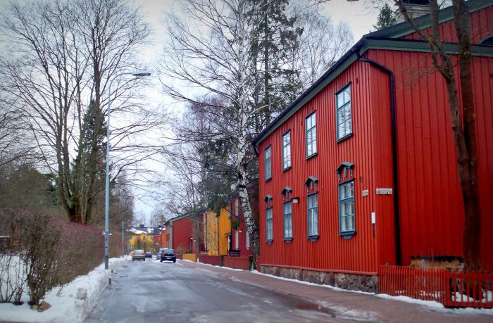
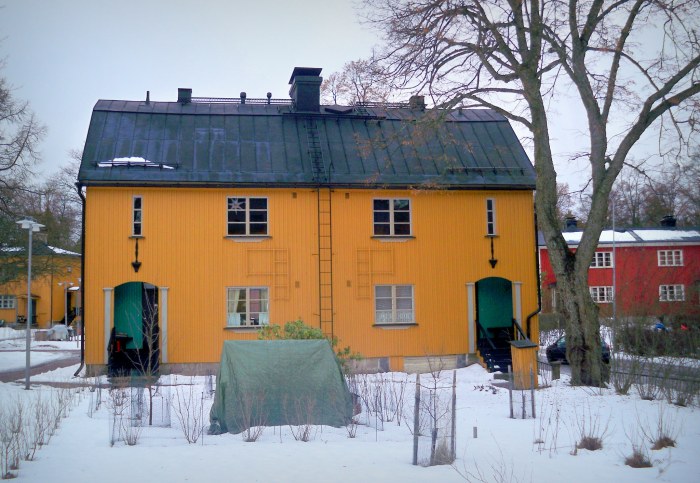
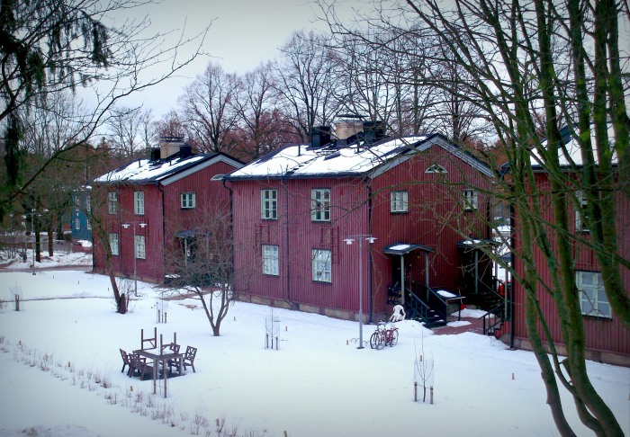
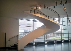
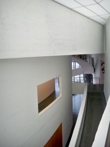
With the establishment of architectural movements such as Rationalism, Functionalism and Modernism suddenly the focus shifted from ”what are we going to design?” to ”who will be using this building and what do they need?”. That question is particularly important to ask if a public building with a function to that of a library is planned to be built. The temple-like structures, sky-high vaulted ceiling, massive colonnades and dimly lit rooms are acceptable if the library was meant to remain primarily an archive. But on the inside these elements together create such a hostile environment that no living being would willingly spend their days in there. In the Ancient Rome many libraries would have gardens attached to the main building because it was expected for a person to pick up a book from the library and read it outside or recite the text to a larger crowd.8 The laws and the social norms of the 21st century would probably stop most from standing on the library doorstep and shouting their just learned Shakespeare poems to the passersby, but the idea that a reading space should be directly connected to the outdoors (instead of resembling a secluded dungeon) or at least imitate some motifs found in the nature has survived and become widely popular. Probably for psychological reasons which there is even no need to explain for any sensible person.

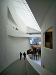
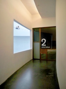
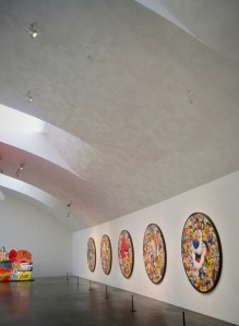
Library is no longer an ”in between space”, or a pick up point for books, or even more depressing – a dedication to a god or a deceased king. It is designed to become a second home, to become a place a person relies on, feels safe in and knows that they can always return to. The most important fact about contemporary libraries is that they are accessible to absolutely everyone, emphasising that it does not matter who you are or where you come from – you still have the right to acquire the same kind of knowledge the most respected doctors and scientists have. The welcoming atmosphere in the libraries encourage people to use these spaces for work in the most informal and peaceful environment.

101_8342.JPG
Rovaniemi Library by Alvar Aalto
101_9330.JPG
Turku Library by JKMM Architects

The desire (or the need?) to show off power and wealth through architecture remains just as important today as it was in the ancient world, however, most libraries seem to have successfully avoided the burden of functioning just as shiny but empty shells. Nowadays behind library designs there are often deep and personal stories of an entire nation. These buildings can be inspired by vernacular architecture, local landscapes and materials, or even folklore. One of such examples is the new National Library of Latvia which was inspired by the concept of the castle of the light – a metaphorical expression, used in a poem (1875), which today could symbolise the rebirth of the knowledge and the intelligence that has risen since the country gained back its independence.

Looking back on the entire history of libraries, it seems at first that these buildings have evolved in a linear way. I see it more as a circle which has now been twice completed and is about to (maybe in a century) enter the third round. There is no doubt that literature’s highest point in history was the time the Ancient Greece, Egypt and Rome flourished, but after many centuries we seem to have reached more or less the same position again, if not already passed by it. The reason why I see a new regression is the age of digitalisation. It is scary to realise how many people have already given up hard copies of books and are now walking around with only their Kindles. It is not really a question of whether the libraries will exist in the future because it is clearly visible that they are now transforming and adapting to the modern age which is being warmly welcomed and accepted by people. The question is – what is going to be that new type of building once the transition is complete?

1. ”The Beginnings,” History of Libraries, accessed February 27, 2016, http://eduscapes.com/history/beginnings/index.htm

2. Bivens-Tatum, Wayne. Libraries and the Enlightenment. Los Angeles: Library Juice Press, 2012.

3. ”Ancient Libraries: 300s BCE,” History of Libraries, accessed February 27, 2016, http://eduscapes.com/history/ancient/300bce.htm

4. Bivens-Tatum, Wayne. Libraries and the Enlightenment.

5. ”A Brief History of Roman Libraries,” The Illustrated History of the Roman Empire, accessed February 27, 2016, http://www.roman-empire.net/articles/article-005.html

6. ”The Medieval Library”, History Readings, accessed February 27, 2016, http://www.historyreadings.com/uk/med_lib/index.html

7. ”Library Anxiety: A Grounded Theory and Its Development,” College and Research Libraries, accessed February 27, 2016, http://crl.acrl.org/content/47/2/160.full.pdf+html

8. ”A Brief History of Roman Libraries”.

Puu-Käpylä. Then and now.

A few months ago I wrote about Puu-Vallila, a small and idyllic 1900s’ wooden district located in the northern part of Helsinki. As I was learning more about its history, the name of Vallila’s younger sister Puu-Käpylä came up, and as soon as the term garden city appeared, I was determined to visit this place right away. These two districts share nearly the same history, the same purpose, the same architectural styles, and many more aspects. However, they both have entirely different and unique identities; something very specific about each one of them that is difficult to describe, but can be immediately felt once you arrive there.

24212454684_42104e1160_k

Puu-Käpylä, like Puu-Vallila, was born out of the pressing necessity for new housing that would provide the working-class families with a higher standard of living conditions at the beginning of the 20th century. Located even further out of the city centre than Vallila, the construction of Puu-Käpylä began in 1920 under the supervision of the project’s main architects Akseli Toivonen and Martti Välikangas.1 Five years later the number of buildings in this neighbourhood had already reached 168. Although the presence of nature in Finnish culture has always played a significant role, the concept of a private garden used for growing food (particularly in such urban environment) was something rather new.

24212538774_3d4cd48684_k

During the 1950s and 1960s when various new Finnish suburbs emerged along with new large housing projects and master plans, the area was facing serious demolition threats. These wooden houses could no longer compete with the new level of comfort and sanitation that the modern suburbs provided (the dwellings in Käpylä, for example, had outdoor toilets), and many of them had already been badly damaged or destroyed in the Second World War.2 In 1960 Ahti Korhonen and Erik Kråkström won the architectural competition organised by the city’s officials. They proposed a new plan for the area which suggested replacing the old wooden buildings with new two-storey stone houses, changing the overall street layout, and turning some of the green areas into parking spaces.3 Even though Käpylä would still remain a Green Suburb (emphasis on green), the sense of community that had grown very strong over the previous decades would have been completely destroyed. For many years an ongoing debate continued between those who supported and those who were against the new plans. Finally, in 1971 an official report, made by a special committee who had investigated the actual conditions of the houses as well as the economical differences between the area’s redevelopment and renovation, declared that the restoration is possible and the buildings are of a historical importance, therefore Puu-Käpylä acquired the status of a conservation area.4 The most significant renovation works took place until 1977, lead by architect Bengt Lundsten.5


The wooden houses in Puu-Käpylä also belong to Nordic Classicism, but compared to the buildings in Puu-Vallila these dwellings appear a lot simpler and more modest. Instead of having the sophisticated and playful gambrel roofs which are very common in the Vallila district, here the houses are often finished with plain gable or hip roofs, while the weatherboarding is covered in darker and earthier tones. These buildings are said to resemble the traditional rural life in Finland, which is quite unlike some of the other examples of Nordic Classicism that try to stand out and impress with their boldness.6

24213699463_b69a469fc9_k

One element that does stand out, however, is the ornaments above and below the window surrounds. These decors help to identify and distinguish the houses, as well as making you admire the craftsmanship of their makers.

Puu-Käpylä feels a lot more spacious than Puu-Vallila, which, of course, is a result of the amount of green space that surrounds the houses. The buildings are aligned in a very straightforward rectangular grid, but the trees and the greenery seem to ignore these boundaries and rebel against the bold geometry, which is probably a lot more noticeable in the summer. Also, the terrain in Vallila, although being far from flat and boring, feels somewhat more tamed than here. From certain hill tops it is possible to overlook nearly the entire neighbourhood, while the bottom of that hill protects a small and fragile fruit tree from the North wind. It is almost as if the wilderness had managed to survive and resist the urbanisation and is now holding onto every little piece of land where the human has not yet placed a concrete foundation.

24814527536_45419a672e_k

It may be that many people would have benefited more if Puu-Käpylä was redeveloped in the 1960s. It may be that the area would have had a completely different importance today. It is very easy to look at a photo of an old building, say that it probably has no use anymore and quickly think of a more profitable way to exploit the site. But it takes a lot of effort to see past that weather-beaten surface and willingness to find the ways in which it is still superior to some of the contemporary buildings rather than emphasising what it lacks. When I look at these pictures now, I, too, see only old wooden houses. But I have been there. I have stood next to them and I clearly remember that intangible uniqueness this area possesses like no other place in Helsinki. And that is the only way to understand the meaning of such places. You have to get familiar with them.

1. Clark, Peter, ed. The European City and Green Space: London, Stockholm, Helsinki and St. Petersburg, 1850-2000. Aldershot: Ashgate Publishing, 2006.

2. ”Puu-Käpylän kaavoituskiista – Kulttuuriympäristöön kohdistuvien asenteiden muuttumisesta 1960-luvulla.” Rakennusperinto.fi. Accessed February 14, 2016. http://www.rakennusperinto.fi/kulttuuriymparisto/artikkelit/fi_FI/Puu_Kapylan_kaavoituskiista/

3. Clark, The European City and Green Space: London, Stockholm, Helsinki and St. Petersburg, 1850-2000.

4. Rakennusperinto.fi. ”Puu-Käpylän kaavoituskiista – Kulttuuriympäristöön kohdistuvien asenteiden muuttumisesta 1960-luvulla.”

5. ”Käpylän puutaloalueet ja Käärmetalo.” Museovirasto. Accessed February 14, 2016. http://www.rky.fi/read/asp/r_kohde_det.aspx?KOHDE_ID=1566

6. Quantrill, Malcom. Finnish Architecture and the Modernist Tradition. London: Taylor & Francis, 1995.

F*ck the authority. Ai WeiWei @ Helsinki.

24524443800_ed058fb2fd_k

From 25.09.2015 to 28.02.2016 HAM (also known as the Helsinki Art Museum) is exhibiting the works of Chinese artist Ai WeiWei. Although my initial reason for wanting to visit this museum was the curiosity about the actual building itself, the artworks displayed inside it were the ones that completely overwhelmed and consumed me.

HAM has found its home at the Tennispalatsi (1938) – a very fine example of Functionalism in central Helsinki, designed by Helge Lundström for the 1940 Summer Olympics which never took place because of the World War II. After its construction, the ‘Tennis Palace’ was never really used for sporting events, with the only exception being the basketball games during the 1952 Summer Olympics.1 Instead, the building has always appeared to be more suitable for hosting business and cultural events, therefore it comes as no surprise that today Tennispalatsi is known as the cultural centre which accommodates a cinema complex and an art museum. It did sadden me a little to see that the interior has entirely lost the connection with the exterior. The 21st century’s obsession with ‘automatic everything’ and the use of cold soulless materials has irreversibly torn apart the building’s insides like a lethal disease. Maybe it has to do with the fact that the building never found its true calling in the first place, thus there was no identity to preserve. So if you are looking for a lesson in the history of Functionalism, this will not be the right place. But if you are after some controversial and thought-provoking contemporary art, do go in.

24452362119_1ed85bf719_k

Born in 1957, Beijing, by now Ai WeiWei seems to have attempted almost every possible form of artistic expression – animation, installation art, architecture, photography, music, film, writing. The range of works featured in this exhibition includes various projects from the past three decades. Some of these artworks are WeiWei’s response to global issues while others retain deeply personal meanings, representing certain events and experiences from the artist’s life.

Ai WeiWei has always been very passionate about human rights and the freedom of speech, emphasising the absolute necessity for the truth to always remain exposed regardless of the cost. His other passion for criticising the authority has caused WeiWei some trouble and numerous collisions with the Chinese government. From being banned from travelling abroad as a potential threat to national security, to being held in detention and accused of various crimes for which, of course, no solid evidence could ever be found.2 So far none of these events have succeeded in silencing the artist’s voice. WeiWei remains determined to rebel against those who would like to see the world full of scared obedient slaves, which is clearly visible in his artwork.

24452228909_19796e7edb_k
The wooden handcuffs and hanger symbolise WeiWei’s time spent in detention.

There is only one element that makes a noticeable connection between all of these unique artworks – wood. The use of this organic material somehow softens the feeling in the room where almost every installation can be seen as a metaphorical fist thrusted in the faces of those holding the power. The choice of wood also shows WeiWei’s respect and worry for the traditional Chinese culture and its future which, in my opinion, is best expressed in the White House installation.

The pale ghost-like skeleton has been assembled using the main structural elements of a residential building dating from the Qing dinasty. By covering the structure in white paint and concealing the imperfections of the old timber beams, WeiWei brings attention to the easiness and carelessness with which things with historical importance and value are torn down, taken apart, transformed, and eventually sold as new. It is the first time this installation has been exhibited anywhere, and it seemed quite fitting that the White House has its debut in the Tennispalatsi – the building which ironically has had the same fate as this little Chinese house.

One of the most popular installations (judging by how many people stopped to take a photo of it or sat down to explore it for a while) seemed to be the Tree. Made of various parts from different dead tree trunks found across the South China, it bears a somewhat strong resemblance to the ‘creature‘ from Marry Shelley’s Frankenstein.

24726469881_f3e742203d_k

You look at it knowing that each of its individual components is dead, and yet, when put together, they manage to form an object which on outside appears to be perfectly fine and functioning – perhaps another reference to the current state of many governments and countries around the world. It made me wonder why this particular installation seemed so appealing; why did everyone, including me, felt so drawn to it. Is it because we all relate to the ”being broken/pretending to be fine” state? Is it because we always automatically start to look for a solution or a fix as soon as something is out of order? Or is it simply because our straightforward thinking minds always get suspicious when we see something that does not look ‘normal’ or ‘natural’?

24819988205_005b25d186_k

Those are only a few of the questions I had in my mind as I left the building. Ai WeiWei’s work most certainly makes you think. It draws your attention to what is really important, makes you laugh about the established system, and provokes feelings and thoughts that certain people wish would never cross your mind.

Helsinki Art Museum: http://www.hamhelsinki.fi/en/
Ai Wei Wei: http://aiweiwei.com/

1. ”Tennispalatsi,” Helsinki Hotels, accessed February 2, 2016, http://www.helsinki-hotels.com/museums/tennispalatsi.htm

2. BBC News, ”China Nobel row: Artist Ai Weiwei stopped from leaving,” BBC.com, accessed February 2, 2016, http://www.bbc.com/news/world-asia-pacific-11909470

Lux Helsinki 2016

Every year as winter approaches and days become shorter, Europe is taken over by numerous light festivals. These events provide great opportunities for designers to create daring and unique installations, while for the visitors those become unforgettable experiences. You would probably expect that in a place like Finland, where in the southern part alone daylight is sometimes present for no more than 4 or 5 hours during the winter, people are equipped with the ability to hibernate and the streets remain empty for a few months. But this assumption could not be any further from the truth. During Lux Helsinki, the light festival which this year took place from 6th to 10th January in the heart of Finland’s capital, the streets were crowded even despite the freezing temperatures. The festival gathered people of all ages and the city was lit up not just by the few extra light bulbs, but also by the many happy faces wandering through its arteries.

23648685683_50ceed8850_k

Here is a brief coverage of some of my favourite installations from Lux Helsinki 2016.

5. Lantern Park.

The clue is in the title. Located in the Old Church Park which is also the home to the oldest church in Helsinki, hundreds of unique lanterns completely transformed the otherwise grim graveyard. The names of large design firms as well as art and design students could be found among the authors. Beautiful, different, provocative, funny. Each of these artworks certainly told a unique story, but, most importantly, they allowed the observer to interpret them and make a very individual decision about the actual meaning behind every lantern.

101_9209

4. CLOUD.

Designed by Caitlind r.c. Brown and Wayne Garrett this interactive installation, which had previously already taken part in various festivals around the world, this time had found its place in the middle of a street and made a very convincing impression of what life would be like if clouds were tangible and existed among us here down on the ground. The never-decreasing crowd around it, made it very clear that the CLOUD was certainly one of the festival’s favourites. Delicate chains hanging down from the main structure allowed every participant to feel like a divine creature who has the power to illuminate or darken parts of a cloud by simply pulling a string. For me the most appealing aspect of this design was the fact that every detail and connection was left exposed, adding even more charm to this installation.

24192983071_45b752478d_k

24167344172_1846416c75_k

3. Ilon kuvia. / Images of Joy.

Images of various artworks projected onto the façade of the Helsinki Cathedral turned one of the city’s most iconic buildings into a three-dimensional canvas, gathering hundreds of people in the Senate Square every evening during the festival. The sheer idea of covering (even if temporarily) a sacral building with graffiti-like designs sounds outrageous and provocative, and therefore makes it so much more exciting and brilliant. Certainly no one really seemed to object to this sacrifice and why would they! It is hard to tell what felt more fascinating – the gigantic artwork being displayed in such a unique way or the feeling of everyone in the crowd being joined in amazement.

2. He olivat täällä. / They were here.

This installation by graphic artist Alexander Reichstein made walking down the Sofiankatu impossible as nearly every passer-by stopped to take a photo of one of the hauntingly beautiful light sculptures. Human figures made of metal wires, sprayed with fluorescent paint and placed along the street were dedicated to this area’s former residents who now remain alive only in the whispers, the shadows and the memories of their successors. Reichstein had undoubtedly managed to capture the bodiless and the evanescent, dressing it in a physical shape. The entire street seemed to be suddenly filled with ghosts frozen in space and time.

23889166049_d1e4cc78b3_k

1. Medicine city.

The authors of this already previously exhibited installation are Antti Pussinen and Martta-Kaisa Virta. Made of more than 20 000 empty aluminium medicine packages, this miniature city represents the modern society’s dependence on medication seeing it as the only solution in dealing with physical, emotional, and virtually any kind of pain. The installation which reflects how alone and broken people can be in the time when overpopulation is a frequently encountered problem, is somewhat tragic and heart-breaking. But at the same time it shows that wonderful things are still born from this state of chaos and being broken (like the installation itself). This is certainly one of those artworks you can observe for hours and realise that new emotions still keep constantly arising within you.

24174431491_958159694b_k

23961363290_cff677f7a4_k

Lux Helsinki full programme:

http://www.luxhelsinki.fi/en

Alvar Aalto Saga. Chapter 4: Finlandia Hall

Finlandia Hall will always remain very special to me. It was the very first Alvar Aalto’s building I studied and analysed very extensively for a university assignment. Assignment which brought me into the world of Finnish Modernism, from which there is now no return for me. Finlandia Hall was also the first ever Aalto’s building I physically saw, and I will certainly never forget the sight of those snow white volumes rising tall against the grey sky, with the dark waters of the Töölö Bay at their feet.

Only now, 4 years later, I finally got the opportunity to also explore the inside of this building myself. Had I done it earlier, perhaps my perception and opinion of Aalto and his works would have developed completely differently as this turned out to be a side of Aalto I do not think I have often (if ever) seen before.

It has always amazed me how organically and flawlessly this building fits into its surroundings. The south-west façade, which faces the busy Mannerheimintie street, is hidden behind a large mound and a thick line of trees that shelter it from all the hustle near the road. This curved and generously glazed façade appears light and playful as if trying to break down the overall level of seriousness and formality this building possesses. After all, being the host of the international Conference on Security and Co-operation in Europe in 1975 which brought together many political leaders from all over the world, it is said that one of the most essential tasks for Finlandia Hall was to clearly manifest the country’s neutral standpoint during the Cold War era and later throughout the irreversible dissolution of the Eastern Bloc.1

As if that was not already enough to expect from one building, the opposite façade reveals the actual size of this design which suggests the grand scale of the entire master plan that Aalto had in mind. Finlandia Hall was originally designed as a part of the extensive Helsinki city centre plan (developed by Aalto in 1960s) which was needed to improve the transport infrastructure, develop some of the central districts including the Töölönlahti, Pasila and Kamppi areas, and to create a new cultural centre along the Töölö bay.2 The plan never even came close to being fully realised, and of all the initially proposed cultural buildings, Finlandia Hall ended up being the only one built. Therefore today it acquires an even more important role as one of the few physical manifestations of Aalto’s vision for the future of Helsinki.

24174200811_a0fb8f7472_k

The Töölö-Bay-facing façade, which attracts most of the attention being the only completely exposed side of this building, truly reflects the nature and the atmosphere of Finlandia Hall. Designed as the building’s main façade, it embodies a sense of firmness, confidence, and certain order, ignoring the Modernist beloved tradition to mass-produce plain, big boxes. Looking from the opposite side of the bay Finlandia Hall merges with its surroundings and visually somewhat resembles an imitation of the nearby-found bare rock hills with their countless bold facets.

Once you have seen its interior, you realise that the building is in many ways transparent and straightforward. Its exterior actually contains many hints of what can be found inside, and you end up with exactly what you have suspected. Unless you are me. As I mentioned at the beginning, I initially learned about Aalto and his design principles through some of his other works which quickly formed my now very strong opinion of him. The architect whose designed spaces make you feel as if your entire living room has been transformed into a forest; whose ability to understand that invisible bond between people and nature makes the terms inside and outside lose their meanings; and whose buildings make you feel at home regardless of their function. Finlandia Hall attempts to achieve all of those three things, but the outcome is not very convincing.

The first thing that immediately stands out upon entering the building is how open and spacious it is. Rather than being isolated from one another by opaque walls the main spaces establish a continuous flow, with the occasional partition wall or column suggesting the otherwise nonexistent boundaries and directing all views towards particular points. Aalto’s exceptional attention to detail and tendency to put the emphasis on human scale are also noticeable straight away. Door handles, handrails, floor lamps, seating areas in the hallways – the building is dominated by these delicate elements which make the person feel appreciated and in control of the environment.

Interestingly, the largest spaces feel the most pleasant and intimate. The foyer outside the main auditorium has been designed as an indoor piazza, trying to retain a strong connection with the outdoors. Relatively divided into various active and passive zones, it allows a large number of people to freely move through this space while others can gather in small groups nearby. The balcony, which overlooks the foyer, makes it possible for the people located on the upper level to participate (at least to an extent) in everything that happens below.

The main auditorium, which I had the highest expectations of, turned out to be the one space that truly exceeded my every hope. Perhaps it is the combination of the white, light brown and soothing dark blue wood panels which imitate the nearby landscape – white Finnish birches against the night sky, or perhaps it is the fan-shaped space which, immediately after entering it, draws your attention towards the stage – the narrowest part of the room, thus distracting from the actual size of the auditorium.3 Either way this space with the seating capacity of 1700 achieves the almost impossible and creates the illusion that you are suddenly inside van Gogh’s Starry Night painting.


Although all of the above mentioned elements are very much Aalto’s trademarks and also the things that usually make his designed spaces feel so inviting and relaxing, this time they are heavily overwhelmed by one single element – Carrara marble. The extensive use of this material for both the exterior and interior of Finlandia Hall has probably caused the biggest arguments and discussions ever since the building was completed. Being the manifestation of Aalto’s life-long appreciation for the Mediterranean and Italian cultures (Carrara marble originates in Italy), this light grey material certainly increases the building’s resemblance to the Ancient Roman temples and encompasses the feel of stability and timelessness. However, the marble seems to be unsuitable for this region not just because of the negative physical impact the local climate leaves on it, but also because of the psychological effects it can have on the observer and user (even though I only speak for myself here). For the entire time I spent inside Finlandia Hall, the feeling of cold did not leave me. And this time it had nothing to do with the fact that it was -15ºC outside – the coldness seemed to radiate directly from the internal marble panels. Instead of encouraging the visitor to engage more with the building, the marble is almost alarming and makes you want to distance yourself from it, which completely destroys all the other Aalto’s attempts at creating another remarkable imitation of ‘indoor nature’. The formal tone is, of course, understandable for a public building with such functions and intentions, but if it indeed was meant to represent an entire nation, or at least its standpoint, at a certain time in the past, I can safely say that the cold and impersonal Carrara marble does not do any justice and would only establish a terribly misleading stereotype about the society where warmth and compassion are the two core elements.

24256611315_bd85ea7dbf_k

There are a lot of things and aspects to talk about when it comes to Finlandia Hall, considering how massive and complex it is. The building was constructed over the period of 8 years, being one of Aalto’s last works. The fact that parts of Finlandia Hall have been designed or later added by another architect is also noticeable when walking through the building as it is difficult to find a definite connecting link between all the wings. But despite the occasional moments where it feels that each one of them is telling a different story, the main notion remains clear.

303098_415099328550782_1609129771_n

Even though Aalto never would have had the chance (or the permission) to finish his plan for the Helsinki city centre in its entirety, it is clear that at least some of his proposals have been taken in consideration and are slowly acquiring a physical form. The Töölönlahti area, which not so long ago was an undeveloped site, is now, indeed, becoming a prominent cultural centre. From the list of the buildings Aalto had envisioned for this location, three have already found their way here (Finnish National Opera (1993), Kiasma (1998), Helsinki Music Centre (2011)) and one more is currently under construction (Helsinki Central Library (2017)). It is a little worrying to see how a large area like this slowly comes together, throwing in pieces from different directions and not following a concise master plan. There is always a risk of turning into a landmark-filled neighbourhood with no particular structure. But seeing that clearly in this case culture has attracted more culture into the same area for over decades, at least there is a hope that the Töölönlahti neighbourhood will develop into a place with a matter and meaning.

1. Pelkonen, Eeva – Liisa. Alvar Aalto: Architecture, Modernity, and Geopolitics. London: Yale University Press, 2009.

2. Mia Hipeli, ”Plans for Helsinki City Center by Alvar Aalto” (paper presented at the international conference on the research of modern architecture UNIVERSAL versus INDIVIDUAL, Jyväskylä, Finland, 30 August – 1 September, 2002).

3. Quantrill, Malcom. Alvar Aalto: A Critical Study. London: Secker & Warburg, 1983.

Puu-Vallila. The little wooden paradise.

As the November rain has taken over Helsinki and I am consuming countless cups of tea to cure my cold, it is time to dig out some of the pictures I took last month while everything was still sunlit and full of life. One of the places I went to was Puu-Vallila which forms a part of Vallila, a neighbourhood just north of central Helsinki. Mainly built between 1900 and 1920 for the working classes, this district precisely reflects my definition of an inhabitable environment that is capable of generating happiness and contributing to the wellness of its inhabitants.

22156634985_c69e185779_k

Puu-Puu-Vallila, which translates as Wooden Vallila, is exactly what its name suggests – a small district consisting of only two-storey high wooden houses. However, the entire neighbourhood of Vallila is dominated by tall apartment buildings, most of which also date back to 1920’s and 1930’s. These developments were created in order to provide the working-class families with dwellings that would help to improve their living conditions and to establish a safe and strong community. How much of that was actually achieved is another question, but there is certainly a sense of unity which remains in Vallila even today. The names of the architects behind all these designs are certainly notable as well – Armas Lindgren (Finnish architect who worked with Eeliel Saarinen and taught Alvar Aalto), Jussi Paatela (Finnish architect who has designed many hospitals accross Finland), his brother Toivo Paatela, and Karl Hård af Segerstad (the Helsinki City Architect from 1907 until 1921).

The little wooden houses are well-hidden behind their tall neighbours that belong to the Nordic Classicism. Placed tightly next to each other, they form a distinct notion of a ‘district within a district’. And less than a minute after leaving Mäkelänkatu, where the large apartment buildings are raising up from the ground so densely that there is not even a space for a grain of sand to fall, you suddenly get a feel that you have left Helsinki behind and are now entering a small old village.

21533900204_0fc5650667_k

There is genuinely nothing that compares to a wooden house in my eyes. A unique relationship has evolved between humans and trees, as a result of wood being possibly one of the most versatile organic materials which has been present in our daily lives since the beginning of civilisation. Maybe it is the long history, or maybe the fact that tree is, after all, also a living being and therefore similar to us in many ways, but there is an undeniable invisible force that draws us to it and relaxes the mind once in its presence. Being well-aware of the psychological impacts wood can create, I was not at all surprised to find myself feeling much calmer and happier as soon as I was surrounded by these colourful houses.

22166826651_377472a5bd_k

Like any building that belongs to Nordic Classicism, these dwellings are very minimalistic, regular and straightfoward, but their appearance is far from dull and boring. The dormer windows cutting through the gambrel roof slopes add a vivid and engaging character to each house, while the boldly coloured wheatherboarding creates that final touch of uniqueness.

Although I just described these houses as minimalistic, once you start to examine them more closely, a number of elegant and delicate details reveal themselves. One of them being the house numbers. Instead of using the flat boring signs that the majority of buildings tend to have these days, here black triangular prisms are attached to each façade. With the house number being engraved on both of the rectangular faces that protrude from the vertical surface, it is easily noticeable from a greater distance, regardless of the side from which you approach the building. But, most importantly, these three-dimensional metal designs help to preserve the overall atmosphere of the past century which still lingers on these streets.

When I mentioned that Puu-Vallila has got all the elements which, in my opinion, define a truly successful and desirable environment for living, I was referring not just to the fact that all the dwellings are made out of wood but also to the level of greenery which encloses and interweaves with this area. Being positioned side by side in a continous line along the streets, these houses are sheltering gardens and internal courtyards of various sizes behind them. In such way, even though the occupants are located in a very central and urban neighbourhood, they still have got their own green spaces where to retreat, without having to actually leave the city. Although it was not the intention to design Puu-Vallila as a garden city, its outline appears to be following somewhat similar principles to those used to design Puu-Käpylä, another wooden district in Helsinki which was built around the same time and for the same purpose as Puu-Vallila (however, Puu-Käpylä is an actual example of a garden city, or rather – district). Here these courtyards and gardens might not be very large and might not receive an adequate amount of sunlight during the day for the people to grow enough food that would allow them to become completely self-sufficient. Nevertheless, they are perfectly suitable for social gatherings or any outdoor activities which would strengthen the sense of community among all the inhabitants.

21969741579_e9ace72b28_k

It is certainly difficult to perceive all the details and peculiarities of a place where you have never lived and where you are just a temporary visitor. Had I met someone who has occupied one of the houses in Puu-Vallila for years, maybe I had just heard stories about how difficult it is to maintain a comfortable temperature inside the house during the summer and winter extremes, or how annoying are the problems caused by all the insects, without even mentioning anything about that psychological nonsense I just described so passionately in 700 words. But seeing that all of these houses are still inhabited, seeing the gardens filled with so many tables, chairs and flower pots, and seeing how well looked-after all the façades appear, I get the feeling that it really is a place which people are happy to call their home.

22130427136_5171c68831_k

Kiasma – American palm print in the heart of Helsinki

I can count on one hand the number of museums that have left a long-lasting and significant impression on me. And it is even simpler with art galleries – there is none. Because, truthfully, the whole concept of walking through numerous spaces stuffed with stained canvases and random piles of scrap defined as ‘sculptures’ feels like something unnatural. Something that degrades each individual work. Nevertheless, it is often worth visiting those exhibition spaces simply because the skin that shelters all the exhibits – the actual building itself – becomes the main art piece which you can still enjoy regardless of how interested you are in its contents.

Most of Steven Holl’s (the American architect behind Kiasma’s design) buildings are very geometric and straightforward, yet always bold and defined by a strong character that never tries to sell the building as a cheap tourist attraction. Although ‘traditional looking‘ could be a phrase used for some of his designs, I have always caught myself carefully examining and feeling somewhat drawn to these buildings whenever I see an image of one. I believe it is because they all have got distinct personalities, which, at the same time, feel approachable and are easy to understand.

Kiasma certainly looks and feels like something that has been completed and opened only yesterday, even though it has stood just south of Töölö Bay since 1998, when it must have appeared ultramodern. The area, which has been slowly unveiling its shape on the map over the last decade, is now developing into a modern cultural and residential neighbourhood with its newest addition (the new Helsinki Central Library) scheduled to be completed in 2018. Since Kiasma was one of the first inhabitants on this site, the strongest connections it has formed are between the art museum and the Töölö Bay as well as the nearby Finlandia Hall, designed by Alvar Aalto. However, its followers seem to have maintained a respectful style pattern and distance, which has helped to establish harmonious relationships between all of the buildings around the bay, also allowing for enough green space and pedestrian routes to be integrated in the new master plan.

Located in the very centre of Helsinki just off Mannerheimintie, Kiasma is daily exposed to hundreds of people who commute by bus, or tram, or simply walk past this building. Because of its distinctly organic shape, the museum certainly stands out from the majority of Holl’s designs, but without losing the main characteristics they all have in common.

101_8548

Although from the outside Kiasma resembles an enormous mechanical robot/creature from a science fiction film, its internal spaces are calm, filled with light and a sense of divine monumentality. The main atrium is defined by the light which enters the space through the transparent south-facing glass façade and the translucent skylights. But as you soon realise, light is the dominant element throughout the entire building, reviving each space in a unique way with every new sunrise.

101_8588

The bridges that seem to disappear into walls, leading visitors to the exhibition rooms, add a dynamic feel and visually break down the overall scale of the space. As they connect different floor levels, you get to experience the space from various heights and angles. These numerous viewpoints continuously reveal a new and previously unseen element within the building – a staircase, a door, another window, or a small lookout space from which you can observe one of the busiest intersections of Mannerheimintie.

There is also a number of exits and entrances to each exhibition space. With the dark tinted glass doors obscuring the view behind, it becomes a surprise whether you will end up on one of the bridges, or at the top of a spiral staircase, or right in front of an elevator door. Of course, you can avoid that surprise by actually studying the map with all the floor plans, but that would take the fun away.

I will not elaborate too much on the actual exhibition rooms because most of them, as it usually happens, deliberately divert the attention from themselves by stepping back into the darkness, so that the exhibited works remain in the foreground. However, it is worth remembering that each space has been designed to display particular works with specific requirements. Therefore many unique architectural elements can be found in every single space if you keep looking not just straight ahead but also up and down. Partially hidden skylights to bring in light from a rather peculiar angle and a small balcony to acquire a better angle for observing the large-scale paintings hung at the top of the double-height space are only a few of the examples of what Kiasma has prepared for those who are willing to give their full attention and look for the invisible.

The one exception that probably does deserve a separate mention is the exhibition space on the top floor. The initial responses generated by the atmosphere in this room are not that far off from the ‘wow-effect’ that you get in the central atrium. The massive sloping ceiling, the deep skylights, the polished concrete floor surface reflecting the incoming daylight, and the grey tones set a scene which sort of reminds of a walk across a frozen lake on a cloudy winter’s day.

101_8608

This room is displaying art works and interactive installations that focus on the delightful topic of the ever-growing consumerism leading the human race towards its end. Therefore the tranquility that radiates from the daylight-filled space itself seems to be working as an invisible safety net for the visitor’s mind to give the hope that maybe the end will not come already tomorrow.

There are undoubtedly different perspectives from which you can look at a building. Especially at a building like this one. I may have ignored and left out certain aspects that someone else would find essential when describing Kiasma. For example, the actual art works inside it. But for me it was not about the art. It was the emotional response to an unfamiliar space that I was after.

Kiasma is definitely one of those places from which no visitor leaves without an opinion or an impression. And, with its ability to appear as if it is growing and changing every day along with the people around it, you will never hear two identical experiences from those who have visited this building.

22460957869_45d1556819_k

Kiasma’s website: http://www.kiasma.fi/en/

Alvar Aalto Saga. Chapter 3: The Aalto Studio

Back to Munkkiniemi then.

Only less than a kilometre away from the Aalto House you can find the Aalto Studio, completed in 1955. The main reason for its existence is the fact that the small studio space inside Aalto’s own house became too cramped for the entire staff, which, eventually, comprised nearly 30 people.

I previously described a part of the Munkkiniemi area as somewhat outdated and almost claustrophobically dense, but Tiilimäki, the street where the Aalto Studio is located, feels like from a completely different world. It is full of Modern and Postmodern gems, and just a single walk down Tiilimäki as well as Rantapolku and Munkkiniemenranta (two closest streets) turns into an incredibly comprehensive and informative lecture on the history of private house developments throughout the last 100 years.

Perhaps because this part of Munkkiniemi is situated very close to the sea, the buildings are more scattered and surrounded by large gardens. The tall fences covered in vines and the pine trees touching the window sills with their needles create an illusion that the nature controls this area. In a civilised way, however.

The Aalto Studio…

As it is with all Aalto’s buildings – you know it, when you see one. Externally this studio resembles the Aalto House in some ways. A tall white brick wall in front of the house and a façade that seems to have turned its back to the street. Even the main entrance is from the side of the building – further away from the pavement, which makes the studio appear like an impregnable fortress from some angles. If this sense of isolation seemed a reasonable choice for the family house, then it is not entirely clear to me why a public building of this kind would have to be so protective. As if the crown jewels were hidden somewhere inside it.

Once you have found the correct entrance and managed to get inside, a rather dark foyer opens up in front of you, leading to some of the smaller staff and service rooms that also include the kitchen/dining area. The style and the organisation of this space is inspired by a taverna, expressing Aalto’s fondness of Mediterranean (especially Italian) cultures. A very warm and welcoming atmosphere radiates from the dining room, however, I am not convinced that this space could successfully accommodate 30 people at the same time without someone spilling a coffee or pushing a chair in their colleague’s back.

Apparently Aalto himself had always occupied the place at the far end – in a corner from which you can easily observe the entire fan-shaped space, including its entrance.

101_8465

When you return from the dining room to the foyer, right in front of you there is a staircase which takes you to the main studio spaces and the meeting room. All of which are located upstairs.

22565963761_f57fd982cc_k

Here it becomes immediately noticeable how bright and spacious the rooms feel compared to the others downstairs. Windows on both sides of the main studio ensure that the space remains filled with natural light throughout the day, while the north-west facing clerestory windows prevent people who work in the room from getting distracted by the garden on the other side of the wall. Upward-facing light fixtures provide additional artificial light during the darker hours of the day by reflecting light from the white sloping ceiling.

Knowing this from my personal experience, no matter how large is the work space given to you, you will always wish for at least one extra square metre. Here, however, I could not help but marvel at the size of the desks and the incredible number of shelves and drawers either placed underneath each of the desks or as separate pieces of furniture to store and to display drawings and material samples. This somehow made it seem impossible that anyone would ever run out of space here, but perhaps a different scene would appear if I visited the studio 50 years earlier during one of its busiest periods.

101_8455

Adjacent to the studio space is the meeting room where all the clients would have been invited to. The atmosphere inside this room is somehow strange. Small amount of daylight enters the space only from the skylights at one side of the room, falling directly onto the slanted wall below which displays selected projects. The rest of the room remains in shadows and is illuminated by a couple of floor and ceiling lamps.

101_8445

It feels a bit like sitting in a big closet, and that comparison is not even too far off from reality, considering that the space was also partially used for file storage, with the now empty cardboard tubes taking up an entire wall. Of course, I imagine the reason for avoiding the use of regular windows in this room could be similar to the decision to use clerestory windows in the studio space – no unnecessary distractions. Nevertheless, I believe the Aalto Studio designed projects that would have been perfectly capable of keeping the client’s full attention even in an entirely glazed room in the middle of the Times Square. And the dark meeting room together with the very reserved and austere façade makes me wonder if the clients ever felt like they were visiting mobsters rather than architects.

For me the highlight of the building was the space Aalto had designed for himself to work in. Although, having always strongly believed in Aalto as a humanist and a very rational person in general, it made me raise my eyebrows when I realised that the space in which he mainly worked alone is almost of the same size as the other room where the rest of the staff would have worked. But I cannot deny the fact that I would also happily accept an office like that myself, so who am I to judge.

22367926739_ff28074cb4_k

As the sloping ceiling turns part of the room into a double-height space, it appears deeper and acquires a sense of lightness. The climbing plants, the large thick carpet, and the lingering presence of the afternoon sun establish a very peaceful, almost meditative atmosphere. Therefore, rather than becoming a dreadfully stiff and formal work environment which results in a higher level of stress and anxiety, it remains a pleasant and calming room which makes you enjoy your work and saves a lot of nerves.

Unlike the other studio space, this one has a strong visual link to the garden and for a very practical reason. In case of a well-attended lecture in the amphitheatre-like garden space, the large windows in the studio can be opened and more people are able to participate even from inside the building.

101_8441

The small balcony in one of the corners of the studio also has a practical purpose – various light fittings (designed by Aalto) are hung from it in order to test their efficiency. Simultaneously this cluster of lamps becomes a peculiar piece of art and makes the space appear more lively and playful.

101_8440

Last but not least, I must mention the garden/courtyard experience as well. Although I had already examined most part of it through the window whilst exploring Aalto’s personal studio space earlier, a feeling of excitement did not leave my side as I exited the building and turned around the first corner where the path towards the central garden space began. There are quite a few turns to take before you reach the main courtyard, and with each turn the tension builds up – you know that, after all, it is Aalto, thus anything could hide behind the next corner. And that is very true in this case. A small detail on one of the façades, a single element in the garden, a different shade of light – you are being continuously surprised by something.

Seems like a different universe exists on every side of the building, one that is completely independent and unrelated to the others. Even the time appears to move at a different pace in each one. While the courtyard is still enjoying the last days of summer, the south-east façade is already watching the golden leaves abandoning trees.

101_8487

The overall vibe in the central courtyard is more tense than in some of the spaces inside the building. Being tightly enclosed by the white brick walls from three sides and a thick layer of vegetation from the fourth, it was difficult to shake the feeling of being trapped. The number of windows on two of the façades also emphasise the feeling that your every movement is probably followed by a pair of eyes. Of course, it is important to remember that it has always been a public building and so has the garden, therefore it is unfair to accuse this space of being too exposed. But, nevertheless, no place should make you feel uneasy regardless of its type and function.

101_8490

As with the Aalto House, there are parts of this building which I admire and others that confuse me. It must have been a very pleasant place to work in, with light and spacious studio spaces and the communal areas (such as the dining room and the amphitheatre in the garden) which would have allowed the entire staff to participate in certain activities together. How much of that atmosphere could have been experienced by a client or any other visitor is not very clear to me. To an outsider the studio can appear a bit unapproachable and secretive, which contradicts everything that Aalto stood for. Nevertheless, it remains a great piece of architecture and certainly a very good example from which to learn what makes a space enjoyable and welcoming and what establishes the opposite feeling.

The Finnish Sacral. Part 1.

Last Sunday I did the unthinkable (for me) – I went to a church. Two, in fact.

But when you are in Finland, the ‘going to church’ experience can be something entirely different from what most people understand with this phrase. Hopefully, these two examples will explain it.

The first place I went to was the Kamppi Chapel of Silence, located in the south-east corner of the Narinkka Square in central Helsinki.

101_8211

The chapel has found home among some very prominent neighbours, including the Structuralist giant – Kamppi Centre which holds the title ‘largest construction site in Finnish history’, and the former Helsinki Central Bus Station building, built in the 19th century as a part of a larger complex of Russian barracks.1 The square itself is quite a unique place. Despite the fact that it is situated right next to Mannerheimintie (one of the biggest and busiest streets in Helsinki), it is always surprisingly quiet there. Even during the most active times of the day.

The chapel is impossible to miss. Once you have spotted it in the first place, that is. Due to the difference in ground levels, the building is half-hidden from the view if you approach the Narinkka Square from the other large street, Simonkatu, which goes along its south edge.

22267393462_d9b1920a26_k

Not only is the chapel sitting about 3 metres below the street level but also a line of trees and the entrance to the underground parking space underneath the Kamppi Centre create a second layer of camouflage. There is no direct entrance from the outside into the large wooden volume, which at first seems to be all there is of this building. Two access points along with a small gallery space and all the service rooms are located in an adjoining volume that visually disappears underground beneath Simonkatu and is externally finished in black, directing all the attention and the emphasis to the wooden structure – the actual chapel and the heart of this building.

101_8133

Even though I know barely anything about any religion, I feel like this space deserves a biblical reference. So the best I can do is to say that, upon entering the chapel, the atmosphere inside made me immediately think – this must be how an upturned Noah’s Ark would look and feel like. And by that I certainly do not mean the feeling of desperation whilst being trapped underneath a flipped boat and knowing that you will probably drown because you cannot get out. Quite the opposite. The smoothly finished alder walls that enclose the space from all directions make you feel safe and protected, while the dark blue floor, which stunningly contrasts with the light wood, reinforces the sense of peacefulness.

22254144056_a4274f84ed_k

And then you look up to the ceiling (by which point you should be already sitting somewhere, or else you will find yourself on the floor). The first question I had to answer in my mind was – am I looking at a manmade structure or a solar eclipse?

101_8162

The skylights create a warm aureole around the central part of the ceiling, bringing in just enough daylight for the visitor to maintain some sort of a connection with the outside world, at least on a subconscious level, but without getting distracted by the never-ending motion that belongs to the city life outside the walls.

22254127126_94495b40e3_k

As soon as the door closes behind you, there is also an overwhelming feel that you have just been magically transported to Japan. Not because of the group of Japanese tourists I encountered on the way in, but because of the place’s striking similarity to some of the works by Shigeru Ban and Tadao Ando. Although the resemblance is not perhaps literal, but rather a one that makes you automatically draw a mental map full of certain cultural associations. Scandinavians most certainly know how to handle wood and how to accentuate its unique qualities. But their designs, with almost no exception, reveal a touch of roughness and wilderness, staying true to their identity which undoubtedly has also been shaped from the very beginning by the harsh climate. While most of the Japanese designs possess a sense of absolute tranquility and perfect delicacy, almost as if every surface was finished with a layer of silk. And that is the feeling that you get inside the Chapel of Silence – a place that becomes something more of a zen garden for you to meditate in and to forget (or to find – depending on what your mind needs).

21659131283_3a9661eeb3_k

My second destination, only a seven-minute-long walk away from the Narinkka Square, was the Temppeliaukion kirkko or the Rock Church, which I first visited back in 2012 and where I had already returned many times since arriving in Helsinki this fall.

101_8208

All this time I used to think that the main space inside this church is the reason why everyone should go see it and which will give you the most descriptive and captivating impression of this place.

How naive of me to think that there is a single building in Finland without an exterior that has its own narrative.

Tightly surrounded by seven-storey high residential and commercial buildings a little bit off the closest main roads, the church is located in a place where you definitely would not expect to find one. Tourists, dropped off at the main entrance, head straight inside. Regular visitors hurry through the main door, without paying much attention to anything. It is all about the main entrance. Sadly.

So, finally, I did what I should have done on my very first visit there – I actually walked around the building….

To my surprise, at the back of the church I found a small path (a very legal one too – see the picture below with the proof in a form of a very formal waste bin that you would not find on any illegal path) which leads up the rock until you reach the roof level.

101_8159

This is another thing I like about Finland – sometimes you are allowed to enter and climb places where in other countries you would have probably been arrested for doing so. Finns are quite laid-back about everything, including things that concern safety. However, do not confuse that with ignorance and them not caring, when it is the very opposite. It is just that they allow people to use their own common sense and to think for themselves, instead of simply putting up a barrier and a ‘Stop’ sign in places where even the smallest possibility of any risk could arise.

Resembling a UFO crash from one angle and a completely random pile of rocks from another, this building is definitely one of the finest examples of the Scandinavian idea about the harmony in which people and nature should coexist. It shows that any place can be altered to acquire a specific function, without completely destroying its original state. In the midst of the very dense and artificial urban environment, this rock, covered in grass, moss, bushes and trees, becomes a reminder that nature is still present everywhere, even if you cannot always see it (think of air and sun radiation, for example). And by encouraging people to interact with it, this also becomes a reminder of how closely intertwined everything is, which is exactly why putting a ‘Stop’ sign at the bottom of that rock would be utterly absurd.

The atmosphere inside the Rock Church differs from the one in the Chapel of Silence on pretty much every level. However, the one thing they both have in common is that immediate feeling of safety and calmness after entering the building. The Kamppi Chapel seems to be all about being with yourself, finding your thoughts in the silence and clearing your mind. In the Rock Church there is something about that feel of togetherness, something almost primeval – people gathering in a rock cave, music playing, and the fire burning in the middle (in this case, the copper dome ceiling will have to do as a metaphorical fire).

101_8231

The skylights play an important role as well. After entering the space, the sunlight creates unique patterns on the floor and the walls, resulting in a view that awakes some inexplicable emotions.

And that is the role of a church in today’s Finnish society. It has become a cultural place for many (non-religious) activities, a (non-religious) music venue, or in some cases, as with the Kamppi Chapel, a place where to escape the mind- and soul-polluting modern life. It almost feels like their function of serving as places of worship is now secondary. The location pattern of these contemporary churches also does not go by unnoticed. Although it may seem irrational to place a sacral building in an entirely commercial area right next to a shopping centre, when you think about it, it does not seem impossible at all that many of the people working in these nearby buildings pay a quick visit to this chapel either during their lunch break or on the way home. Everyone talks about designing these public spaces that would encourage more frequent social interactions in the time when, more than anything, we crave a peaceful place just for ourselves. And right when we need them the most, these kind of spaces have become a nearly extinct species.

1. D.B.Bordas, ”Kampin keskus”, Centre de Cultura Contemporània de Barcelona, http://www.publicspace.org/en/works/d169-kampin-keskus.

Alvar Aalto Saga. Chapter 1: The Aalto House

How did that saying go – show me your friends and I will tell you who you are?

Well, for architects it must be something like – show me your home and I will tell you who you are.

I imagine everyone must have a role model or two, at least at some point in their lives. Someone who inspires you to run that extra mile or to learn that language you would have otherwise never learned. Someone whose way of speaking makes you want to jump up from the seat and go straight to the library (or just use Google, I am being very old-school here) to find out more about what they were talking about. Someone whose words and actions you find resonating very deeply within yourself.

That last one is how I feel about Alvar Aalto.

Invading someone’s private space, even if they are technically no longer living there, is something I absolutely loathe. Having said that, could you possibly refuse if an opportunity arose to take a look at the place which has inspired and observed the creation of some of your most admired works; a place designed by its owner for himself, therefore [arguably] becoming a reflection of this person? A person who you have looked up to for a long time. I guess the fact that this blog post exists is also the answer to that question.

Let’s begin with Munkkiniemi, the area where the Aalto House is located. There is nothing particularly exceptional about this neighbourhood on the east side of Helsinki. Quite densely inhabited, this place is a home to many Functionalist buildings dating from the late 1930s, when the most extensive phase of the Munkkiniemi development took place. Although there is an access to the sea and many green spaces, some of the smaller streets feel cramped and somewhat outdated. Almost as if this place never made it to the 21st century. Nevertheless, you get the feel that everything is being looked after with a great care and all the buildings seem to have found a useful function, be it the original or a new one.

Back in 1935 Riihitie must have been quite an exposed street with a very different feeling, while today it is shyly hiding behind the trees that enclose it from the south and tall apartment buildings that create an impenetrable border along the opposite side of the road. Although Alvar Aalto and his family moved to Munkkiniemi right before most of its big developments had begun, he must have been prepared for that because the house has taken a very defensive position towards the street.

101_8061

A tall brick wall and a façade with only two windows (one in the space initially used by the office’s secretary, the other one hinting at the location of the staircase inside the building) is what the visitor is being greeted by upon arrival. As you approach the entrance, one of the main notions used throughout the building makes itself apparent – the house can be perceived on two different scales: massing and volumes, details and textuality. What first appears to be just two building volumes in different colours, on a closer inspection reveal two delicate textures. One of them being the dark wood and the other one – white painted brick.

101_8033

101_8050

It is no secret that the Aalto House became the experimental ground for many ideas which some years later were repeated (in an improved manner) in Villa Mairea. There are countless similarities between these two buildings – from the external appearance to the relationship between the internal spaces and the use of certain elements to achieve a particular atmosphere.

The journey through the house begins in a small hallway which leads in three directions further inside the building. One door takes you to the studio space through the reception area, another one leads to the kitchen, while the third one opens up to the living room. Aalto’s signature – metaphorical expressions of nature’s presence indoors – is written all over the place. The most astonishing, as I had expected, is the use of daylight, especially in the living and dining rooms.

101_7975

Windows stretching nearly across all south-facing walls, firstly, make the rooms appear more spacious, but, most importantly, they establish the feeling that the garden on the other side of the glass becomes an extension to the rooms which you can enjoy and observe without leaving the fireside on a cold winter’s day.

Having learned this a few years ago from the Schröder House in Utrecht, I know that sometimes there is more than meets the eye when it comes to buildings of this scale and function designed by certain architects. But unlike Gerrit Rietveld, who regardless of the initial request to design a house as open as possible still, in my opinion, went quite high up on the scale of ridiculousness trying to show off all the tricks he had, Aalto is being a lot more modest and, dare I say, practical. Sliding doors that disappear into walls and thick curtains that also function as a warm and homely interior decor allow to create a large open plan space as they connect the studio, the living and the dining rooms. And, when required, they become the distinct boundaries that easily separate the public/working space from the private rooms. Although when our tour guide demonstrated another modifiable element of the house – the dining table whose length can be altered when necessary, with the additional extension parts being kept in a secret compartment built at the back of a cupboard, I could not refrain from smiling. Boys and their toys.

One more thing that becomes noticeable early on inside the house is the change in floor levels and the use of different ceiling heights. Steps from the living room and the reception, being the lowest points, lead up to the studio space, from where another six steps take you further up to a small study room. However, it is in no way an indication of the hierarchy of spaces, but rather the result of adapting the house to the terrain (because that is what you do when you are Alvar Aalto, or a Finn in general). The ceiling height in the living room seems lower than in other parts of the house, creating a very warm and intimate atmosphere which makes you want to curl up on the sofa next to the fireplace and watch the yellow leaves as they fall from the trees in the garden. Meanwhile the double height ceiling in the studio, just behind the wall, establishes a very uplifting and refreshing mood that would certainly contribute to the level of productivity in this space.

101_7970

A lot of the furniture around the house is the production of Artek, designed by Aalto himself. However, there are also a few lamps created by the Danish designer Poul Henningsen as well as some beautiful artwork and sculptures by Le Corbusier and other artists – all of which enhance Aalto’s designs and fit the overall atmosphere very well. To find so many works by various designers, painters and sculptors featured in this house is not a surprise, knowing that Aalto prefered to make friends with people involved in any creative field but architecture. Quite understandable – imagine all your gatherings with someone constantly venting about how dysfunctional is the parking space outside their house in relation to their neighbour’s space, and how it distorts the axis that would have otherwise made a seamless visual connection between their living room window and the unappreciated miracle that is the 100-year-old shed across the street.

Finally, it would not be an Aalto house if it did not have a magnificent garden. Although in this case most of the credit must be given to his first wife Aino. Even here in the garden the play between contrasts – the open and the enclosed spaces, the public and the private – is in full swing. Where the white brick wall encloses the territory, the garden is open and transparent, without any trees in the way.

101_7993

Where the wall ends and a rocky slope begins, a line of trees has been planted in the middle of the garden to hide the living room windows behind them. These trees also create a small private internal courtyard, leaving on the other side a pathway, which continues around the house. In a very simple but effective way, using mainly just trees and rocks, there is the same kind of distinction between spaces of different purposes established in the garden, as there is inside the house using the obvious elements such as walls and doors.

Describing what it meant for me to be able to walk through these spaces is pointless, as it is something that would lose its essence and become trivial and banal once put into words. Do I think this is the perfect house? Absolutely not. The flat roof, although an essential element of any Modern style building, in this latitude makes me want to raise a lot of questions. Also, was there really a need for a second living room upstairs, when the space could have been used to reposition the relatively small and dark children’s rooms so that they would be facing south? And why, of all the places in the house, would you put skylights in the closet? But as I said at the beginning about the house being a possible reflection of Aalto’s personality – as it is with people, we rarely manage to thoroughly understand someone because they are in control of deciding how much to reveal themselves and how much to keep back. The same goes for a house. If you have not lived in it, you will never fully understand the meaning of each space, or the specific lifestyle of the family which occupies that building. Luckily, as a part of our evolution, we have learned to ignore the flaws and accept things as they are. And it is also how I will remember the home of my favourite architect – the October sun filling every corner of the living room with its light and warmth, the colourful leaves covering the balcony floor and the window sills, and those weird skylights in the closet…